The Steel diaries
 It’s a pickaxe, stupid
By Ian Mackenzie
Your regular Steel diaries correspondent, Michael Wheeler, has kindly allowed me to hijack this week’s post in order to bring you a message from the front lines of the show’s marketing campaign.
It’s a message that involves 12 image files (including the intro shot, above) and judicious use of the word “PhotoShopped”. Mostly, this entry into the Steel diaries is about process, which makes it right at home among Michael’s other entries.
The challenge
As part of our marketing strategy for Steel, we’ve arranged to place ads for our show in the programs of a couple of other productions. The nice people at Stranger Theatre, for example, agreed to run a Steel ad in their and what Alice found there program. But since we’re still a few months away from our show’s March run, we hadn’t yet given a lot of thought to the design of our promotional poster and postcard, nor do we have a graphic designer on board to help with such endeavors.
So, with limited resources we set out to build the ad ourselves. The upside is quick turnaround. The downside is diminished quality and limited expertise.
The iconography
We knew, from marketing a previous workshop version of the show, that the pickaxe was a strong icon to work with.
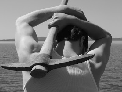 Promotional shot from an earlier production of Steel.
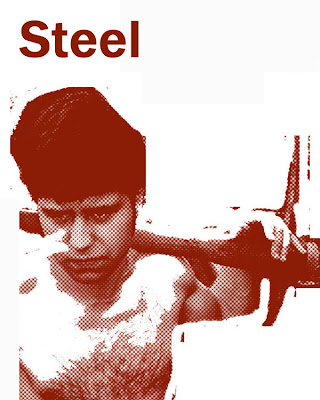 Another promotional image from an earlier production of Steel.
Instead of trying to reinvent the wheel for this latest incarnation of the show, we agreed to keep working with the pickaxe image.
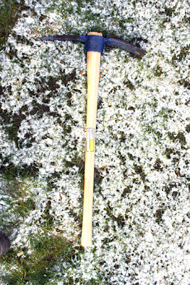
This is our new pickaxe:
Putting it together
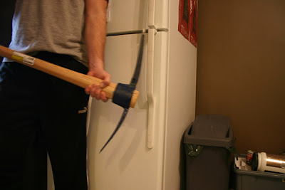
We started with this hastily taken image:
To soften the impact of the aggressive-looking pickaxe and to contextualize it with the railroad, we pulled this image off the Internet:
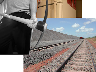 . . . stripped out the colour and cropped the image to the ad’s specifications (3.9 x 4.9).
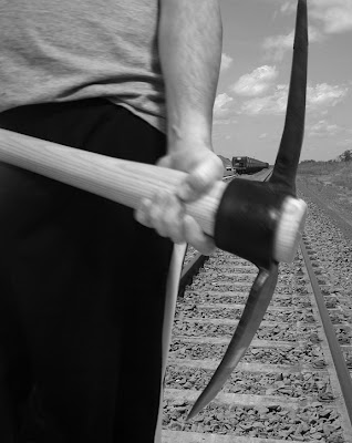 We tried to include our logo, but given the composition of this ad, we would have had to run the logo in reverse (i.e., white logo on black background).
Because of the distressed treatment of the type, our logo doesn’t look good when reproduced in reverse in small scale. (For more info on our logo, please feel free to check out our logo’s usages guidelines here.) And while we don’t like the idea of running an ad without our logo on it, we made the executive decision to leave it out of this piece.
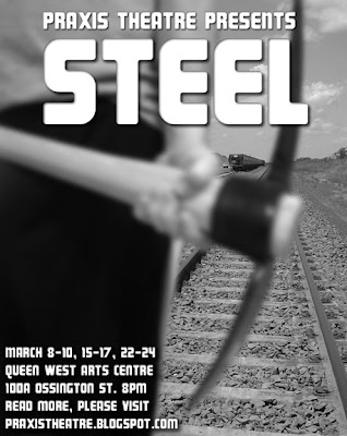
Finally, we added our text.
No masterpiece, but it gets the job done.
With only minutes to spare on our deadline, we sent it off to our contact at Stranger Theatre only to discover we’d built the ad to the wrong orientation.
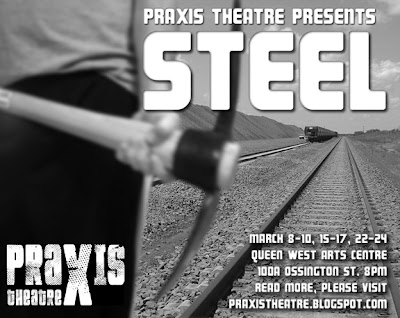
Here’s the recut, landscape-oriented version:
The ad saw its first light of day at the premier of Stanger Theatre’s and what Alice found there.
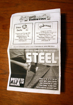 Here’s the final ad in Stranger Theatre’s program.
Much thanks to Kate Cayley and Lea Ambros for the great back cover placement!
(BTW, and what Alice found there runs until February 4. Check it out if you can.)
Lessons learned
1. Decide on and stick with a consistent visual motif.
2. Always verify your ad’s orientation (landscape or portrait) before you start.
3. Make sure to include your logo in your ad.
4. Ad swapping is a great way to dramatically increase media impressions.
5. Use the word “PhotoShopped” sparingly.
This is only a prototype
We’re hoping this initial foray into Steel’s marketing campaign will provide the inspiration for a more professional execution as we draw closer to the show.
I like the basic idea and composition used here. I think we may be able to find a more suitable typeface, develop a colour version, use our actor, James Murray, as the model, find a solution to our logo woes, and generally tweak the layout.
If you’re in Toronto over the next few months and happen to see a poster or program ad with a pickaxe on it, please think of us and our show and these beginnings to our marketing campaign.



this is friggin great. good storytelling with visual tools. internet makes it so much easier to do shit like that. word up. jimmy’s agent wants to get in on this and have him make postcards out of whatever our final image is for distribution to casting directors. i think this will put them heavily in favour of putting his face on this thing which shouldn’t hurt really.
Thanks Mike.
Including Jimmy’s face in phase 2 is a good idea. Faces always make interesting subjects.